Create a content style guide. Put it in writing.
When there’s only one writer, it’s not too hard to keep your style, formatting, and tone of voice consistent.
But when you start working with multiple writers, it can be hard to keep everyone on the same page.
That’s a problem, because inconsistent branding turns customers off. They see Jekyll-and-Hyde content as a sign that your products or services aren’t up to snuff.
Consistent branding breeds trust and directly influences purchase decisions. In fact, companies with consistent branding outperform weaker brands by 20%.
With a content style guide, it’s easier to keep things cohesive across teams and platforms. Plus, you’ll save time tackling new projects when you have a framework to start with.
Here are 5 content style guides to inspire you:
1. Mailchimp
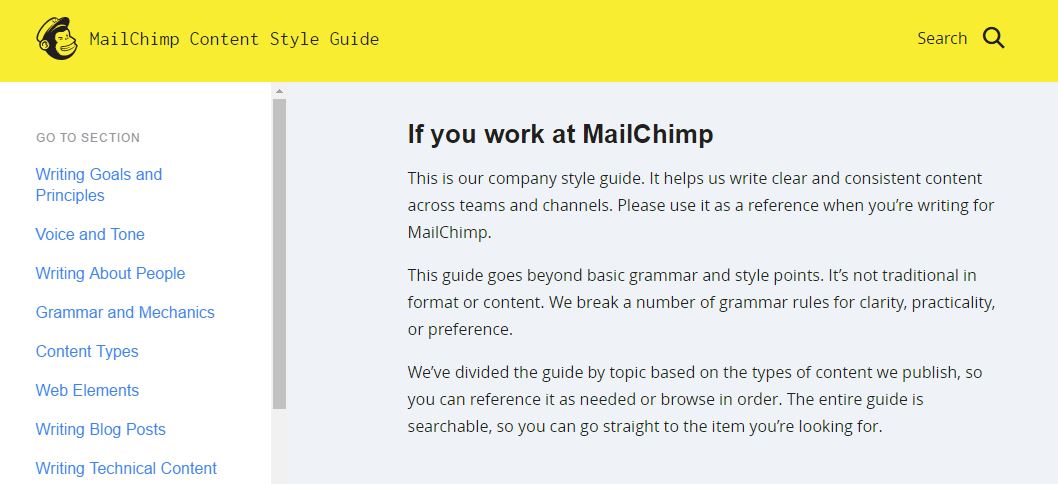
The Mailchimp Content Style Guide is the holy grail of style guides. First and foremost, it’s written for humans. Instead of being a dusty PDF, it’s an interactive website that lets team members quickly find what they’re looking for. It’s also completely public and available under a Creative Commons license, so you can use and adapt it for your needs.
2. Buffer
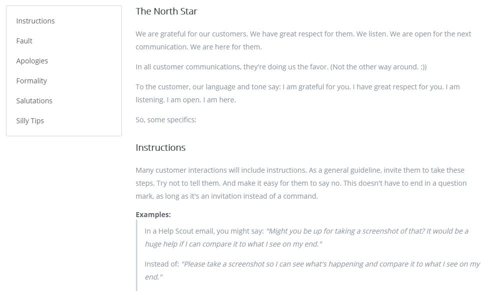
Does the idea of a style guide feel too stiff and constraining? The Buffer Tone Guide definitely isn’t. Part of Buffer’s charm is each team member’s unique voice. Writers write as themselves, and sign off posts, emails, and social media with their own names. The brand guide honors that with a set of general guidelines on writing to customers.
3. Basecamp
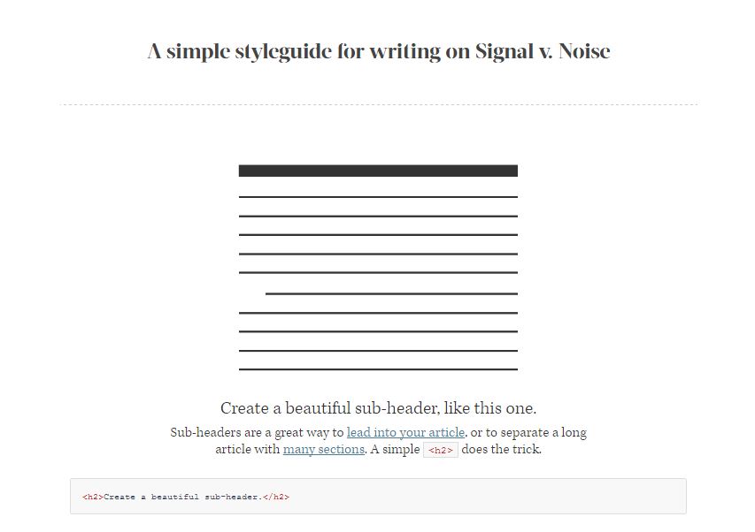
At Basecamp, everyone writes — not just “writers”. Their designers are heavily involved in writing content, so it’s no surprise the Signal v. Noise Style Guide is all about layout and formatting for readers. As a result, their readable content makes it easy for users to focus on the message.
4. The Economist
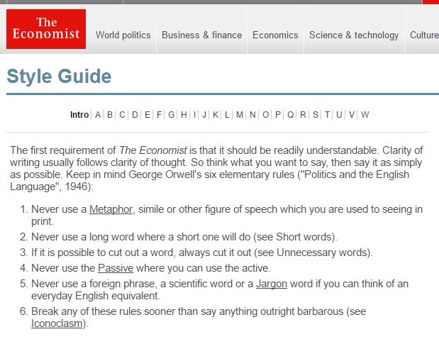
The Economist’s rules to live by? “The first requirement of The Economist is that it should be readily understandable. Clarity of writing usually follows clarity of thought. So think what you want to say, then say it as simply as possible.” The full Economist Style Guide gets into minute details, but the “do’s” and “don’ts” in the introduction are useful to any brand that values crisp, clear writing.
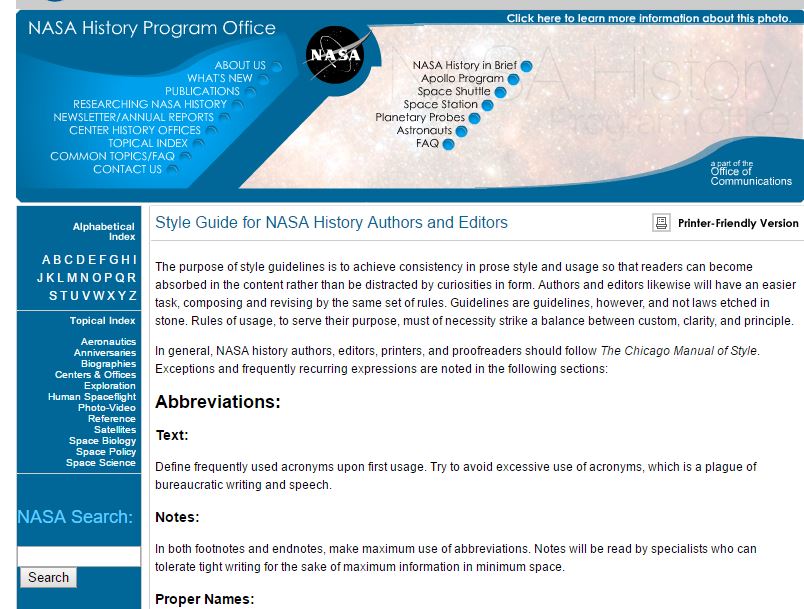
5. NASA
According to NASA, “The purpose of style guidelines is to achieve consistency in prose style and usage so that readers can become absorbed in the content rather than be distracted by curiosities in form. Authors and editors likewise will have an easier task, composing and revising by the same set of rules.” If your writing involves a lot of technical detail, the NASA Style Guide is worth a look.
If you’re interested in voice and style, you might also like:
Nicely Said: Writing for the Web with Style and Purpose by Nicole Fenton and Kate Kiefer Lee
Between You & Me: Confessions of a Comma Queen by Mary Norris
 I'm Christine Lellis, a copywriter and certified content marketer from Michigan.